

KPI Generator
Automated KPI calculation and production
Automation of KPI calculation enables you to speed up production of all organisational KPIs giving you accurate up-to-date information and significant resource savings over existing methods.
The Amber Green KPI Generator retains KPIs and their constituent elements for all previous periods and allows simple presentation of headline KPIs plus analysis – drilling, slicing and dicing – by any required dimensions. Because the underlying elements are also stored, the factors determining changes in performance are easily identifiable using tools such as PowerBI, SSRS or Business Objects.
Benefits:
- Fully automated according to your required schedule
- Eliminates re-keying from reports into performance system
- Ensures consistent KPI calculation method
- Saves management and performance team time
- Enables users to interactively direct analysis
Features:
- KPIs can be set for daily, weekly, monthly, quarterly or annual periods
- KPIs can be based on a single period, year to date or rolling annual period
- Each KPI has a target, based on either a single period or annual profile
- When KPIs are generated, both variance from the target and percentage variance from the target are also calculated and stored
- Optional weighted profiles to reflect known seasonal variations (eg Xmas, winter etc) can be used to inflate or deflate targets
- Headline KPIs are stored in a single table for easy access
- Dimensionally modelled tables and views for each KPI provide the ability to analyse data as required
How Does It Work?
The KPI Generator uses a database to:
- Store the definition of each KPI - formula and code to extract each KPI Element
- Store ‘metadata’ about each KPI - name, description, owner, business area, frequency etc
- Store the KPI Target and the option of an additional Benchmark and/or a Target Profile
- Store analytic requirements for each KPI - how you want to filter, break down, slice/dice, drill
- Store the additional data items you want to include in analysis and reports
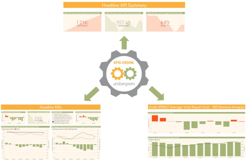
The KPI Generator Engine runs every day and creates any KPIs due for production. The KPI Engine produces 3 outputs:
- Headline KPI data in a single table - easy to query and use for reports and dashboards
- A ‘Fact’ table for each KPI - this contains the KPI Elements and all the required ‘Dimensions’ to enable analysis, drilling, slicing/dicing
- A ‘View’ based on the Fact KPI containing the required columns and the KPI Elements - a simple to use 2-D spreadsheet-type table with all required data
The results can be used with any reporting tool (for example Microsoft SSRS, PowerBI or Business Objects) to create powerful, interactive dashboards and reports.
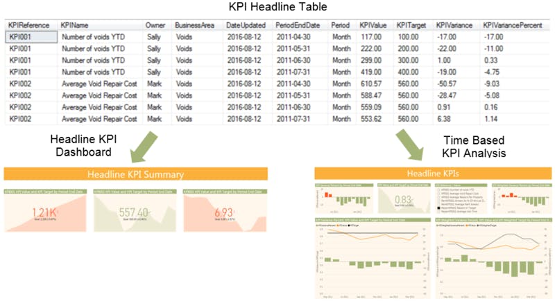
KPI Headline Table
The headline table is ideal for producing headline KPI dashboards and performance analysis over time.
It is very straightfoward to create these as there is no joining of tables required and just simple criteria needed such as date range. All the necessary data is already present in the table.
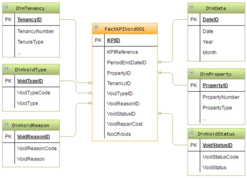
KPI Fact Table
For slightly more advanced report writers, the KPI Fact tables (one Fact table per KPI) and associated Dimension tables can be used to create any data set required. This is actually also very easy as the table joins required are self-evident and the data structure has deliberately been made very simple.
Either you can create these datasets yourselves, or Amber Green will be able to create these to your requirements.
The resultant datasets can then be used with your preferred reporting tool to create interative reports.
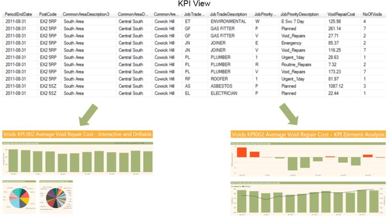
KPI View
A View is created for each KPI. This provides a simple 2-dimensional table which includes all the Dimensions and Columns you have specified (via an easy to use front end). The Dimensions and Columns included can be modified as required, and the View is updated to relected your changes.
This makes interactive, analytical report creation really simple. The example shown includes one report with a KPI displayed over time, and two further breakdowns in pie charts by different Dimensions.
The second report shows the KPI value in the top chart, and the two constituent elements in the lower chart (Void repair cost and Number of voids in this case). This enables you to see how each element varies over time and their affect on the KPI value.
All of these examples are available for you to try out and experiment with in the interactive section of this web page, above.
You can't break anything, so give it a try!